the greenish one makes me want to vomit
The first poster is awsome, but I think the first two better posters
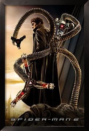
spiderman 2 had some awsome posters
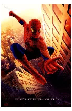
and spiderman had a pretty good one to
| World of KJ http://www.worldofkj.com/forum/ |
|
| New Spiderman posters http://www.worldofkj.com/forum/viewtopic.php?f=2&t=25292 |
Page 1 of 1 |
| Author: | MadGez [ Wed Nov 22, 2006 2:22 am ] |
| Post subject: | New Spiderman posters |
I like both of these... http://comingsoon.net/images/spidey3newposter1.jpg http://comingsoon.net/images/spidey3newposter2.jpg or http://comingsoon.net/news/movienews.php?id=17652 (for both) |
|
| Author: | David [ Wed Nov 22, 2006 2:33 am ] |
| Post subject: | |
I prefer the one without the greenish tint, but the image is great either way. |
|
| Author: | ashwani [ Wed Nov 22, 2006 2:57 am ] |
| Post subject: | |
AWESOME posters!!! |
|
| Author: | STEVE ROGERS [ Wed Nov 22, 2006 2:57 am ] |
| Post subject: | Re: New Spiderman posters |
MadGez wrote: Both look Fantastic, but I do prefer the 1st one without the green tint.. |
|
| Author: | DIB2 [ Wed Nov 22, 2006 3:07 am ] |
| Post subject: | |
the greenish one makes me want to vomit The first poster is awsome, but I think the first two better posters spiderman 2 had some awsome posters
and spiderman had a pretty good one to
|
|
| Author: | Joker's Thug #3 [ Wed Nov 22, 2006 3:43 am ] |
| Post subject: | |
That Neo-Glow look is pretty retarded. |
|
| Author: | Dr. Lecter [ Wed Nov 22, 2006 8:00 am ] |
| Post subject: | |
Looking great, especially the first one. |
|
| Author: | Riggs [ Wed Nov 22, 2006 9:18 am ] |
| Post subject: | |
The first one really looks great. |
|
| Author: | Anita Hussein Briem [ Wed Nov 22, 2006 2:28 pm ] |
| Post subject: | |
I just realised Spiderman and Playstation3 have the same font. Is it a proprietary Sony font or something? |
|
| Author: | Shack [ Wed Nov 22, 2006 3:45 pm ] |
| Post subject: | |
First one is good, second one looks like a bad internet mod of the first. |
|
| Author: | Thegun [ Wed Nov 22, 2006 4:56 pm ] |
| Post subject: | |
First one is good, 2nd one is awful. |
|
| Author: | MovieDude [ Wed Nov 22, 2006 6:33 pm ] |
| Post subject: | |
Hitokiri Battousai wrote: I just realised Spiderman and Playstation3 have the same font. Is it a proprietary Sony font or something? Wouldn't be surprised, it was also in the titles of Stealth. 
And while the second one isn't as nice, if we had only seen that version I know people wouldn't be calling it awful. |
|
| Author: | matatonio [ Wed Nov 22, 2006 7:50 pm ] |
| Post subject: | |
they look great, especially the greenish one... |
|
| Author: | Excel [ Wed Nov 22, 2006 10:58 pm ] |
| Post subject: | |
sickkk |
|
| Author: | Bell [ Sat Nov 25, 2006 12:36 pm ] |
| Post subject: | |
Nice poster. really great. love it very much. |
|
| Page 1 of 1 | All times are UTC - 5 hours [ DST ] |
| Powered by phpBB © 2000, 2002, 2005, 2007 phpBB Group http://www.phpbb.com/ |
|